Watiets took on an assignment for Danish based Tanketeket, run by Baukje Avlund Erthmann.
Not only is she a very dear friend to Watiets, she also runs a succesfull business in teaching people to learn and develop, Tanketeket, something you could roughly translate into think-library…
We are illustrating and developing learning materials together for her to work with. More on that later, very exciting!
When we got started, we knew this project would involve a lot of illustrations, in many different styles and levels of complexity, due to the purpose of the product: learning materials.
We felt we needed to make sure all the materials should be held together in a clear frame, how would we keep all this work in one style?
We decided to make ourselves a colour scheme, that we would use for all drawings. And to stick to it. That was the hard part.
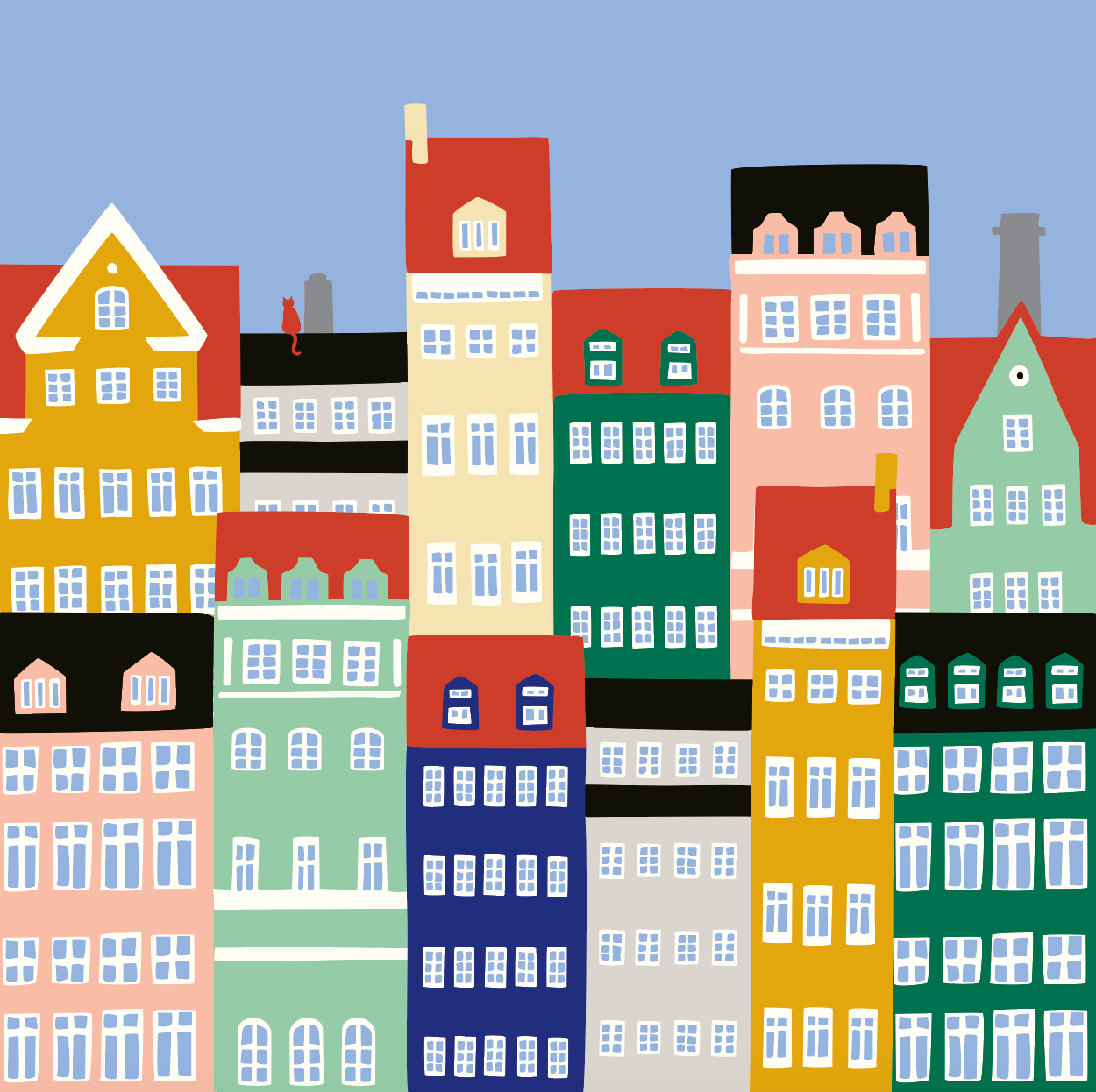
As Tanketeket is a Danish based company, beautifully situated on a hill by the seaside village of Gudhjem on the island Bornholm, daily life there is filled with traditional colours.
We did some research on the use of traditonal colours and paints in Scandinavian countries, architecture, design, and decided to use this heritage as our starting point.
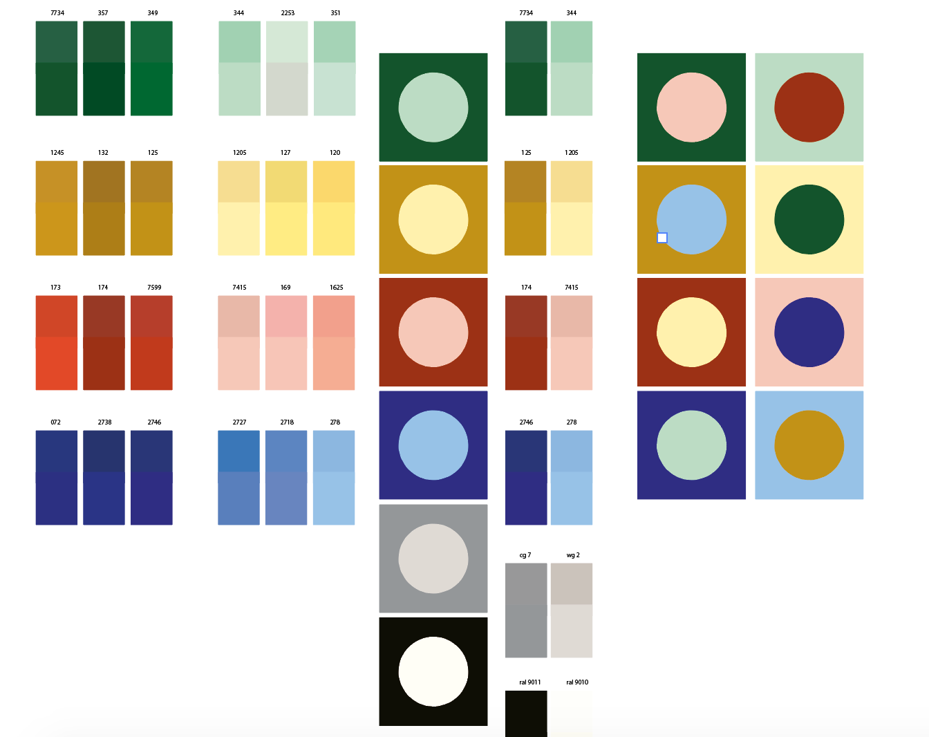
We developed a colour card using modern translation tools to make sure our colours would be digital, print and publish proof.
Apart from all this, we wanted to make a colour scheme that would be new and fresh, bright and friendly, fashionable and sustainable.
We have been working with our colour scheme for a while now and are impressed by the easy use of these early made choices. And most of all? When we use the dark red, in the back of our heads we see Gudhjems museum, with the blues we see the skies and with the yellow we see Baukjes house.
For us this is what adds that certain something to these colours, the Watiets.
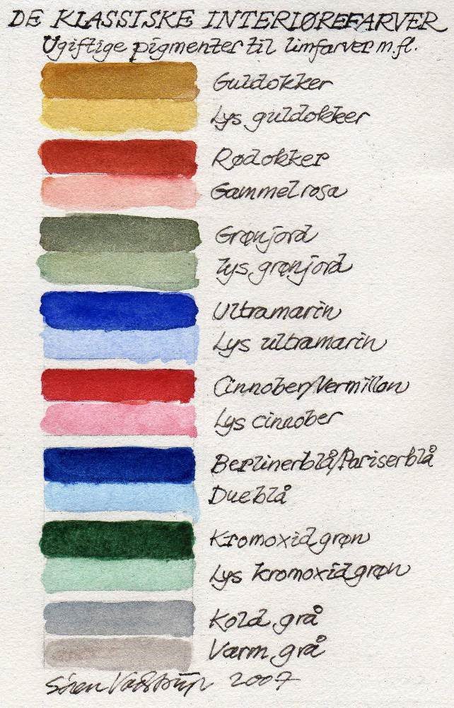
The classic Scandinavian colours we found.
Roughly translated to our taste and use, but also to how we remember the colours from our visits to Denmark.
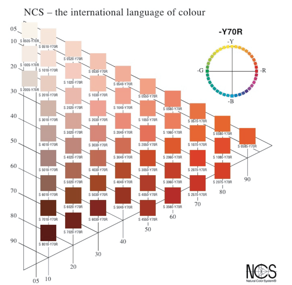
Translating colours to a standardized system, so we can put them to work in print and digital.
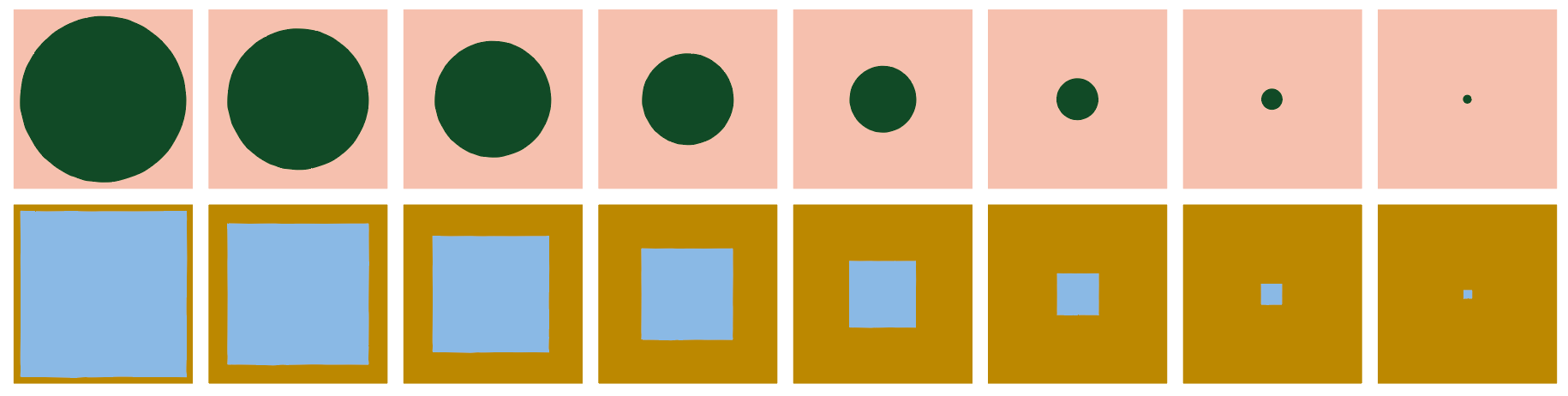
First trials, can we combine? Do the colours like eachother and will they work well?

Love this process piece!